Daikin
Daikin
Creating and refining the Daikin Hero Cloud Design System
Creating and refining the Daikin Hero Cloud Design System


Label
Label
Label

Label

Label
Label
Label

components
variables
grids
icons
typescale
colors
Label
Label
Label
Label
Label
Label
Label
components
variables
grids
icons
typescale
colors
Label
Label
Label

Label
Label
Label
Label
components
variables
grids
icons
typescale
colors
Label
Label
Label
Label
Label
Label
Label
components
variables
grids
icons
typescale
colors
ROLE
Lead Designer
Lead Designer
CLIENT
Daikin
Daikin
SKILLS
Variables, Components, UI Design, Figma
Variables, Components, UI Design, Figma
SKILLS
Variables, Components, UI Design, Figma
The Problem
The Problem
While working on the Daikin Hero Cloud features team I started documenting components and pattens our team was establishing into a design library.
However, while I was a long time user of Sketch, Daikin was my first project using Figma. I still had a learning curve of the tool and also creating designs systems, especially as a team of one.
Fast forward to 2 years later, our design system was expanding and needed to be cleaned up and refined to help our team move even faster.
The Goal
The Goal
While there was a lot that was worked on, these were the main goals and improvements we wanted to accomplish:
While there was a lot that was worked on, these were the main goals and improvements we wanted to accomplish:
✧ Refactor components to use frames and auto layout, not groups
✧ Refactor components to use frames and auto layout, not groups
✧ Establish color, spacing, and border radius variables
✧ Establish color, spacing, and border radius variables
✧ Improve structure and semantics for component variants
✧ Improve structure and semantics for component variants
✧ Create themes with color variables for light and dark mode
✧ Create themes with color variables for light and dark mode
✧ Improve scaling of components to help speed up responsive designs
✧ Improve scaling of components to help speed up responsive designs
✧ Refactor components to help create and edit tables more easily
✧ Refactor components to help create and edit tables more easily
✧ Easily toggle nested component properties on/off
✧ Easily toggle nested component properties on/off
Our Team
Our Team
Initially it was one other designer and myself who kicked off the project. We later gained two other designers to help execute our goals.
Initially it was one other designer and myself who kicked off the project. We later gained two other designers to help execute our goals.
My Role
My Role
After two years on the features team, maintaining the design system independently, I took the lead on creating its V2. My deep understanding of design patterns and team pain points made me well-equipped to drive the improvement efforts.
After two years on the features team, maintaining the design system independently, I took the lead on creating its V2. My deep understanding of design patterns and team pain points made me well-equipped to drive the improvement efforts.
Brainstorm
Brainstorm
Since I was going to lead this efforts and I took some time to brainstorm what would be the best approach. The following is what I came up with:
Since I was going to lead this efforts and I took some time to brainstorm what would be the best approach. The following is what I came up with:
01
01
Just like any design project that needs improvements I knew I needed to reach out to our users, our designers on our features team, to gain feedback and discover their pain points.
Just like any design project that needs improvements I knew I needed to reach out to our users, our designers on our features team, to gain feedback and discover their pain points.
Interview Users
Interview Users
Gain Feedback
Gain Feedback
Discover
Pain Points
Discover
Pain Points
02
02
Since our team focused on features, design system questions often got lost in our Slack channel. To improve organization and ensure feedback wasn’t overlooked, I created a dedicated Slack channel for all design system communication as we began refining it.
Since our team focused on features, design system questions often got lost in our Slack channel. To improve organization and ensure feedback wasn’t overlooked, I created a dedicated Slack channel for all design system communication as we began refining it.

#daikin-hero-cloud
#daikin-hero-cloud-design-system
#daikin-hero-cloud-
design-system
03
03
I also did an audit of our current design system and came up with pain points I was seeing as a user and also as someone who was much more knowledgeable in Figma than when she first created the v1 of the design system.
I also did an audit of our current design system and came up with pain points I was seeing as a user and also as someone who was much more knowledgeable in Figma than when she first created the v1 of the design system.

🔍
👩💻
📝
Pain Points
Pain Points
After communicating with our features team and gaining feedback these were the pain points I was hearing and noticed within my own audit of the current library:
After communicating with our features team and gaining feedback these were the pain points I was hearing and noticed within my own audit of the current library:
✧ A wish for responsive templates with populated components to easily and quickly create designs
✧ A wish for responsive templates with populated components to easily and quickly create designs
✧ Easily create light and dark mode variations of designs due to the clients request to have both included for all screens with hand off
✧ Easily create light and dark mode variations of designs due to the clients request to have both included for all screens with hand off
✧ Easily toggle between variants and their nested properties
✧ Easily toggle between variants and their nested properties
✧ Make more components scale and responsive to help with hand off of responsive design
✧ Make more components scale and responsive to help with hand off of responsive design
✧ Create variables for colors and spacing due to their recent release at the time and to help speed workflow and improve design consistency
✧ Create variables for colors and spacing due to their recent release at the time and to help speed workflow and improve design consistency
Research
Research
While our team was familiar with using design systems and creating components we wanted to research best practices and investigate what other design system teams had done to help improve and organize their design system.
Furthermore, Figma variables had only just come out at the time and we wanted to take some time to research and how to best implement them.
These are some of the following systems I looked into:


Learnings
Learnings
✧ Our file navigation was similar to many of the file above; we made minor tweaks there
✧ Our file navigation was similar to many of the file above; we made minor tweaks there
✧ Include a dedicated changelog page in Figma to easily track publishes and changes
✧ Include a dedicated changelog page in Figma to easily track publishes and changes
✧ Variant naming and organization structure along with organizations of properties of variants
✧ Variant naming and organization structure along with organizations of properties of variants
Laying the groundwork
Laying the groundwork
In order to create components for a design system you need to have the following defined: colors, typography, spacing, and icons.
I decided our first steps would be to create:
In order to create components for a design system you need to have the following defined: colors, typography, spacing, and icons.
I decided our first steps would be to create:
✧ Create and define a color system
○ Define primitive colors
○ Create primitive color variables
✧ Create and define a color system
○ Define primitive colors
○ Create primitive color variables
✧ Create semantic color variables
✧ Create semantic color variables
✧ Create light/dark mode themes
✧ Create light/dark mode themes
✧ Audit typography to use 4px system and create new font styles
✧ Audit typography to use 4px system and create new font styles
✧ Create spacing variables
✧ Create spacing variables
Library File Creation and Structure
Library File Creation and Structure
Our design system was currently only being used by our team and it was unclear if it would be used outside our team in the future.
At this point in time we decided to keep all of our components in one library file rather than individuals library files for each component type.
Our design system was currently only being used by our team and it was unclear if it would be used outside our team in the future.
At this point in time we decided to keep all of our components in one library file rather than individuals library files for each component type.


Color system
Color system
Figma had just released their beta version of variables a few months prior. In our research we learned that many design teams were creating color ramps and creating a set of primitive colors and then applying those primitives to their semantic colors.
We looked into creating color ramps of each color we were already using however we had a few things against us:
✧ Limited time/deadlines
✧ Limited time/deadlines
✧ Auditing all of our colors and replacing ones that were closest in the color ramps
✧ Auditing all of our colors and replacing ones that were closest in the color ramps
✧ Clients approval
✧ Clients approval
With this in mind we decided to make primitives and color ramps with existing colors even if it wasn’t a full spectrum of each individual color.
This helped us save time and didn’t have to worry about client feedback about colors changing. We decided in the future when we have time we would revisit true color ramps.
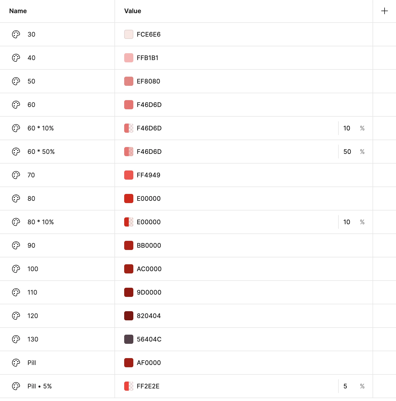
Primitive Variables
Primitive Variables
We created a separate collection in our local variables for our primitives. These would be our hex color value variables that we could then link to global and component specific variables.
We created a separate collection in our local variables for our primitives. These would be our hex color value variables that we could then link to global and component specific variables.


Primitive Color Variables


Global Semantic Variables
Global Semantic Variables
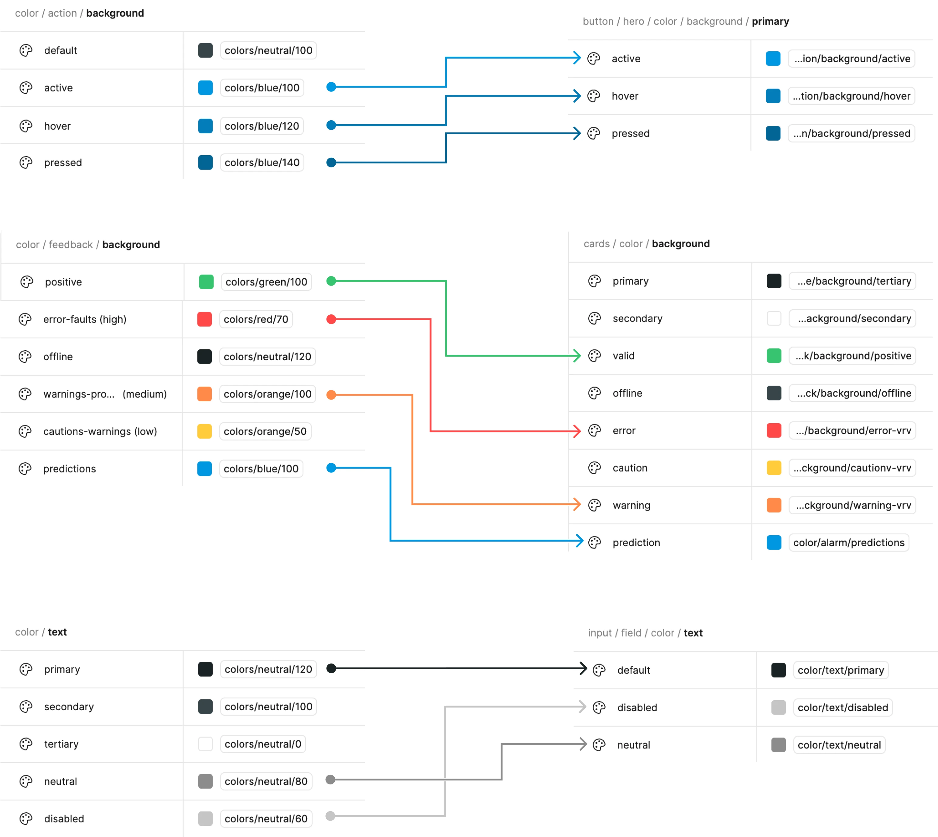
After defining our primitive variables we then set up our global semantic color variables which referenced the primitive variables.
This includes defining color variables for design elements with colors that are frequently used, such as:
After defining our primitive variables we then set up our global semantic color variables which referenced the primitive variables.
This includes defining color variables for design elements with colors that are frequently used, such as:
✧ Text color
✧ Text color
✧ Surface colors
✧ Surface colors
✧ Success/Error state colors
✧ Success/Error state colors
✧ Alert colors
✧ Alert colors
✧ Action colors (active, hover, pressed, disabled)
✧ Action colors (active, hover, pressed, disabled)
Setting up these global color variables allows us to change commonly used colors easily throughout the app if needed, since we linked them in the component specific variables we created next.
Setting up these global color variables allows us to change commonly used colors easily throughout the app if needed, since we linked them in the component specific variables we created next.


Component Specific Variables
Component Specific Variables
With our global semantic variables set up, we could start creating component specific variables and link them to the global ones.
Once again allowing us to edit colors in the future easily if needed.
With our global semantic variables set up, we could start creating component specific variables and link them to the global ones.
Once again allowing us to edit colors in the future easily if needed.

Spacing, Border Width, Radius Variables
Spacing, Border Width, Radius Variables
We created spacing, border width, and radius variables in order to improve consistency of these design elements throughout the app.
We created spacing, border width, and radius variables in order to improve consistency of these design elements throughout the app.


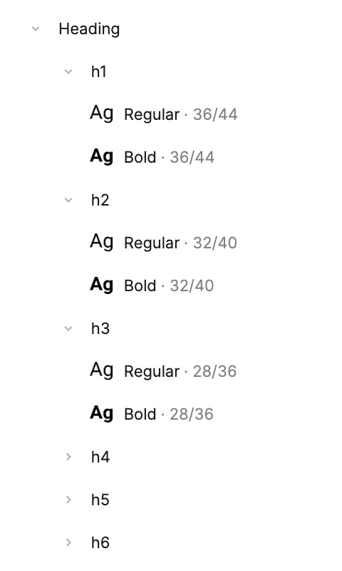
Typography & Font Styles
Typography & Font Styles
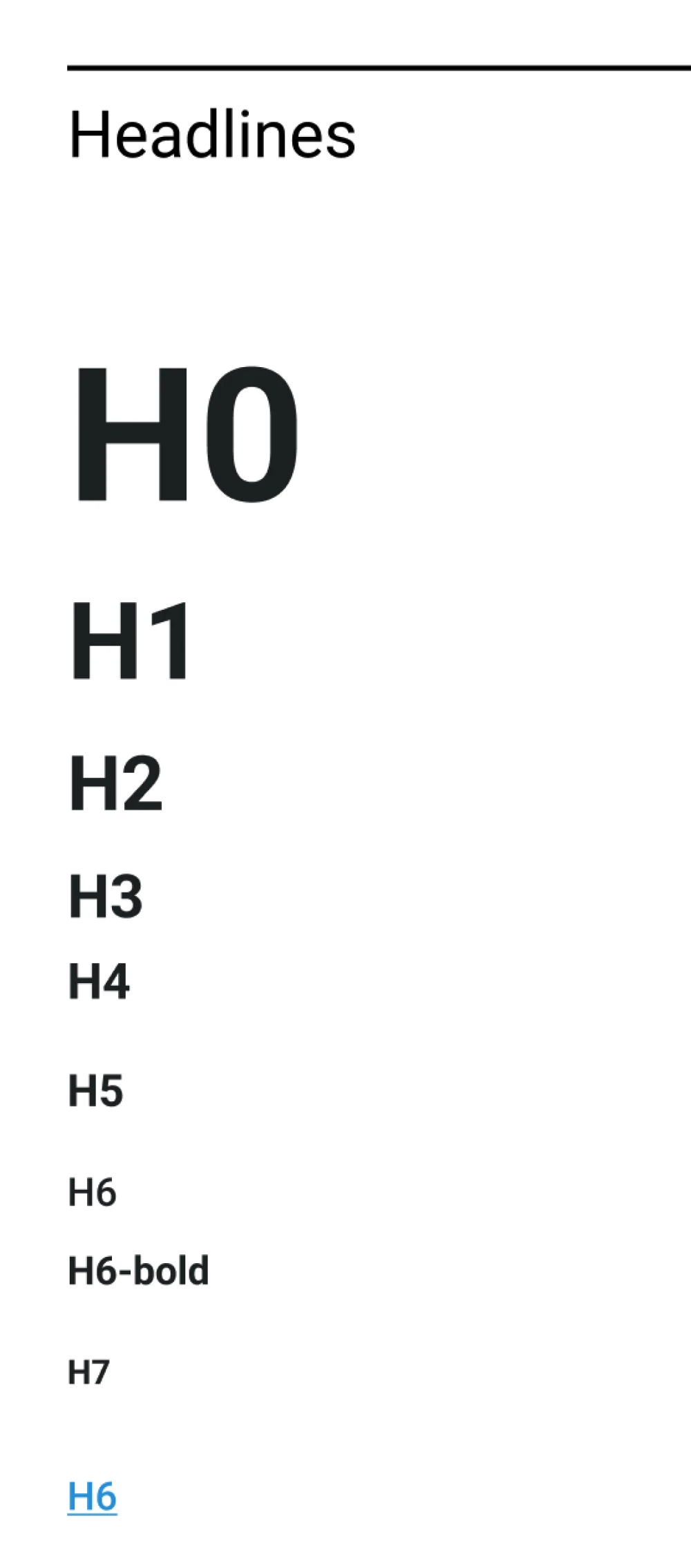
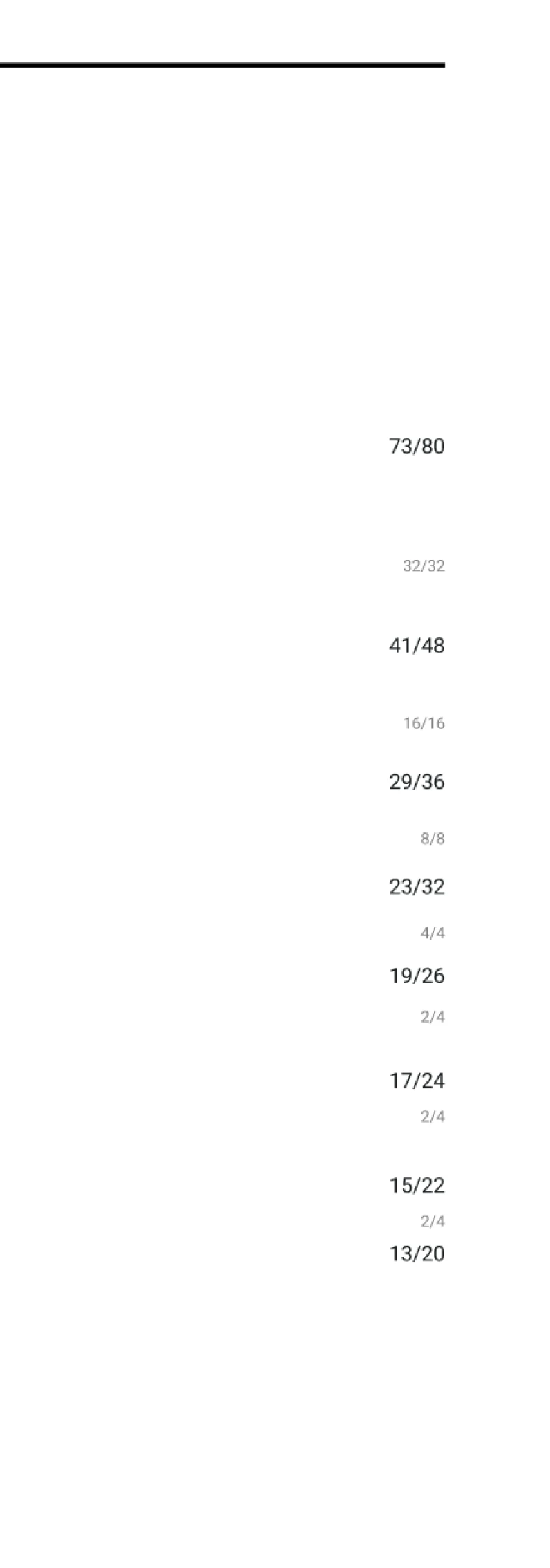
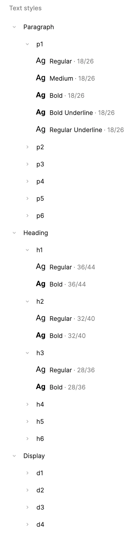
Our previous type scale had been using odd numbers. We decided to adjust it to be even numbers to match our spacing of 4px increments.
Our features team had also expressed how they wanted more definition between font sizes and font weights. With this in mind we created more hierarchy creating display, heading, and paragraph font styles with multiple font weights.

Before


After

Before
After
Before
After
Creating Components
Creating Components
With all of our variables and font styles in place, it was time to start building components!
While creating our components we utilized our font styles, spacing variables, and color variables and applied them as needed.
We also added variants and properties to each component as needed and surfaced the properties into the parent layer of the component.
Below are a few examples of the updates we made:
❖ Buttons
❖ Buttons

Before
In the first version of the library I had been creating different components and variants for each button type. This created a lot of components and was messy.


Before
In the first version of the library I had been creating different components and variants for each button type. This created a lot of components and was messy.
Before
In the first version of the library I had been creating different components and variants for each button type. This created a lot of components and was messy.

After
In the second version we created one button component that had many different variants where you could alternate between primary, secondary, and tertiary buttons and swap for different states and styles easily.


After
In the second version we created one button component that had many different variants where you could alternate between primary, secondary, and tertiary buttons and swap for different states and styles easily.
After
In the second version we created one button component that had many different variants where you could alternate between primary, secondary, and tertiary buttons and swap for different states and styles easily.
❖ Tables
❖ Tables
Before
Previously I had been creating components for rows of each individual table we had throughout the app and included variants of the rows.

Before
Previously I had been creating components for rows of each individual table we had throughout the app and included variants of the rows.

Before
Previously I had been creating components for rows of each individual table we had throughout the app and included variants of the rows.

After
Now instead of having row components for each specific table we decided to make components of each cell type used in all the tables. We then used frames and auto layout to combine cells to make rows for our tables.
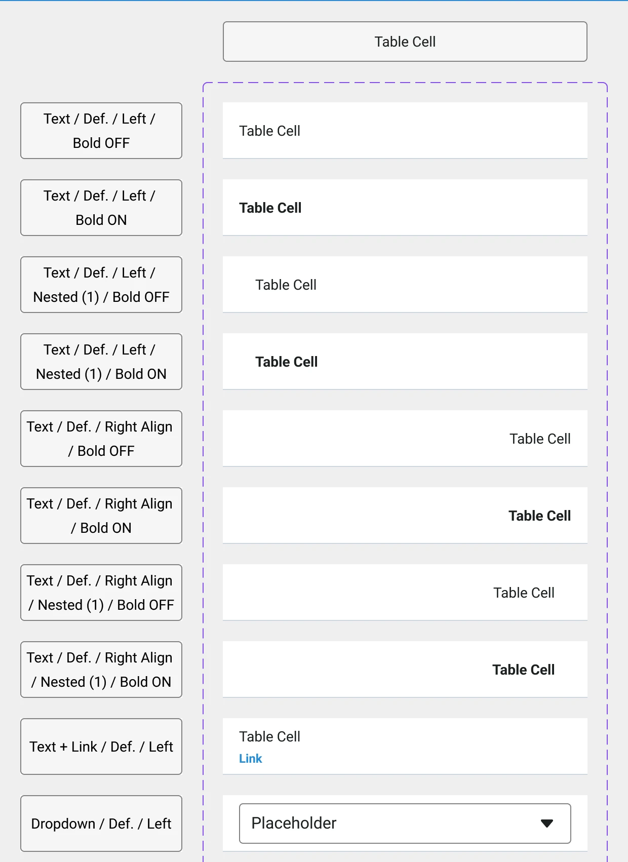
After
Now instead of having row components for each specific table we decided to make components of each cell type used in all the tables. We then used frames and auto layout to combine cells to make rows for our tables.
After
Now instead of having row components for each specific table we decided to make components of each cell type used in all the tables. We then used frames and auto layout to combine cells to make rows for our tables.
❖ Cards
❖ Cards
Before
Many components, including cards, were only using groups rather than frames and auto layout.
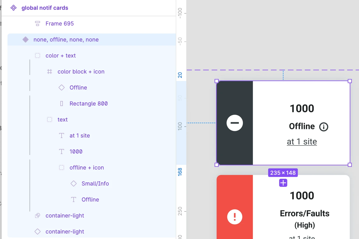
Before
Many components, including cards, were only using groups rather than frames and auto layout.
Before
Many components, including cards, were only using groups rather than frames and auto layout.

After
Now any card components were updated to use frames and auto layout to help scale and easily build them.

After
Now any card components were updated to use frames and auto layout to help scale and easily build them.
After
Now any card components were updated to use frames and auto layout to help scale and easily build them.
Dark Mode Variables
Dark Mode Variables
Our team prioritized light mode since that is what designers worked in. As a last step after all components were created I added the color variables for dark mode as a second theme. After this we could easily swap artboards between light and dark mode.
Our team prioritized light mode since that is what designers worked in. As a last step after all components were created I added the color variables for dark mode as a second theme. After this we could easily swap artboards between light and dark mode.

Template Creation
Template Creation
Our features team requested responsive templates of commonly used components to help speed up work flow when starting new features.
A few of the templates we created were:
Our features team requested responsive templates of commonly used components to help speed up work flow when starting new features.
A few of the templates we created were:
✧ A blank page with header, navigation, page title, and footer components
✧ A blank page with header, navigation, page title, and footer components
✧ Same as above with tabs components
✧ Same as above with tabs components
✧ A table template with the table header components and auto layout rows with component cells
✧ A table template with the table header components and auto layout rows with component cells

Results
Results
✧ Our features team usage of component increased; making collaboration easier and faster 🤝
✧ Our features team usage of component increased; making collaboration easier and faster 🤝
✧ Positive feedback from features team stating the improvements to library helped speed up work flow and was easy to use 🎉
✧ Positive feedback from features team stating the improvements to library helped speed up work flow and was easy to use 🎉
✧ Our features team continued increased interest and engagement with developing and improving the library 💬
✧ Our features team continued increased interest and engagement with developing and improving the library 💬
Reflection & Next Steps
Reflection & Next Steps
✧ Due to time constraints we were unable to make true color ramps. If we have time in the future I think it would be a great addition to help with organization and creation of new colors.
✧ Due to time constraints we were unable to make true color ramps. If we have time in the future I think it would be a great addition to help with organization and creation of new colors.
✧ Create more interactive components to help speed up prototype creation work flow.
✧ Create more interactive components to help speed up prototype creation work flow.
✧ Currently the library has minimal documentation. As the team expands and adds new designers it is nice to have more thorough documentation for commonly asked questions we received on Slack.
✧ Currently the library has minimal documentation. As the team expands and adds new designers it is nice to have more thorough documentation for commonly asked questions we received on Slack.